A few weeks back, I wrote about the The Big Oops and the Big Fix in our center hall. The tale of my making a huge dumb-ass choice in paint color for the ceiling, and then the magical fix a few hours later.
I am sure after last weeks posts about the black ceiling (Part one and Part two), that you are expecting photos of the living room…. but you’re gonna have to wait… (Soon…. I promise!).
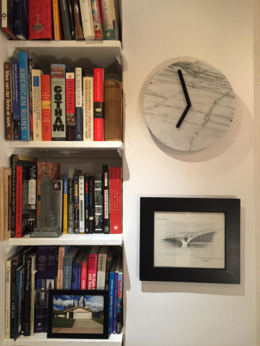
So, instead, I am excited to show you the newest updates to the center hall. We have books on the shelves, art on the walls, , custom lighting, and best of all, an amazing chandelier purchased from Italy. (That house in the picture is my childhood home in California.)
After we finished painting the now cottage red ceiling, we began to load up the bookshelves. I was not originally a fan of the shelves when we first saw the apartment, primarily because they are not original, and were kinda installed a bit wonky. But, at least for the time being, they are exactly what we need to handle my book collection. (I have whittled my book collection down by about 75% over the past few years, and still have a lot of books. I am trying to only hold onto the ones that really matter.)
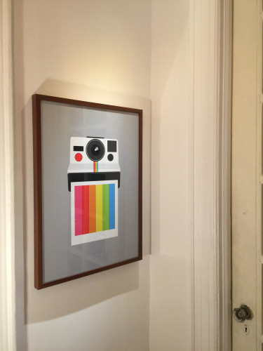
Polaroid Print from the Yumalum Shop on Etsy framed in a faux woodrgrain Ikea Ribba frame.
Once we had the books up, it was time to figure out the art. We love that there are basically three walls in which to put art. However, the space on each of them is narrow and subject to being easily bumped. Yoav thought the Polaroid print would go perfect in spot between the kitchen and living room doors. And he is totally right.
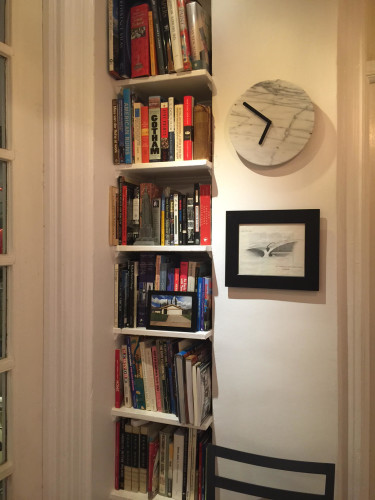
An expanded view of the shot at the top of this post. There is stuff in the space between living room door and bedroom door… Finally
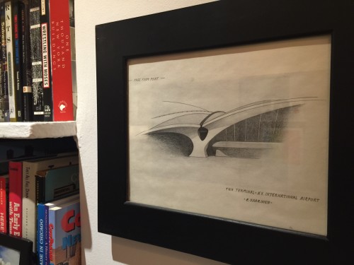
The space between the books and the bedroom door is narrow, and we tried several things out, but in the end, the marble clock I wrote about last month, and our pencil drawing of Terminal 5 (which means a lot to me) was the perfect choice.
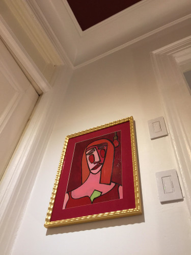
As for the space between the bedroom and bathroom doors, this is the most important space of all. Most important because you can see it from more than 40 feet away when you walk in the front door of our apartment. We knew what ever ended up there must be an important piece, and we tried several different options, each of us taking a turn holding up different pieces as the other stood back and thunk it over. Then we finally had our moment of clarity, or rather our moment of “Duh!”
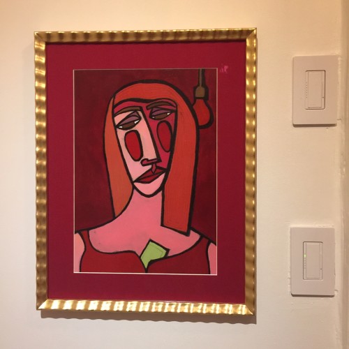
“Red Light District” (aka Lulu) in an elegant new frame. (And fancy new Lutron Maestro CL dimmer switches for LED lighting)
We had the “Red Light District” (We call her Lulu) piece framed just a few weeks ago. I found her on eBay for not a lot of money. As a painting, it’s not exactly the best quality art, probably a student project, but regardless, we love her which is all that matters. The gilded wavy 90’s style frame was not what either Yoav or I would have picked at all, but the staff at our favorite framing shop suggested it because it was shaped like the curves of a woman (as if we would have figured that out) and then when he added the red linen mat it was super fabulous, doncha think? The gilded frame came from Italy and because we planned on putting her up in the living room, we opted to use pricey museum glass, and we ended up spending about four time what we paid for her, but we have zero regrets. Besides, it’s only fitting that two gay men have a painting of a whore on the wall right? Anyway, we had initially planned a certain spot in the living room for her, but it turned out that wasn’t really the best place. After hanging her in a few other places, we realized that she really belonged right there, in the most prominent place possible, in the center hall. The became especially clear once the ceiling was painted red. The combo of the red from the ceiling, and the gold leaf frame, and the various reds in the painting itself made this the perfect place.
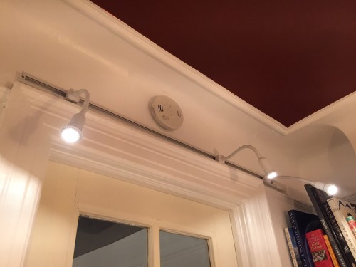
After the art was hung, we were thinking about lighting. The light that was in the hall when we moved in was in a style I could call “landlord cheap ass ugly I don’t have to live there chic“. Except it was from the 80s, it’s not and was never chic, and I doubt he spent more than $5 on it. When we hung the art, it became clear that we needed to have additional lighting to focus on the art itself and not so much the space.
This was my solution. I picked up a four foot track and some goose-neck fixtures for next to nothing, and then picked up some GU10 LED bulbs online. I mounted the track on the wall above the door to the living room for two reasons. first, it would be relatively easy to run power to the track. And second, I wanted the light source to be less obvious when you walked into the hall and to not detract from the ceiling or the other light fixture.
Now that I had the spot lighting issue resolved, I needed to get the main light installed. Originally I had planned to hang my vintage red Lucite spaghetti lamp which I had hanging in my previous apartment. It is fun, funky, and cool….. But with the living room chandelier being such a show stopper, my red spaghetti lamp (as much as I love it) was nowhere near the same taste level. It suddenly felt tacky, I mean, I like kitsch as much as the next gay decorator, but this was not going to live up to what I had already established in the living room. I will probably end up putting it on Craigslist.
Thus began the quest for the right chandelier for the center hall…. I immediately thought about something elegant that would elevate the space. Something that wouldn’t compete with the living room chandelier, something that was sized appropriately for the small space, and something that still made a statement on it’s own. I first began my quest with looking at new fixtures…. But the ones I liked were either far too expensive, or cheap and boring. Next up, I went to my old standby, eBay. I have been able to acquire quite a few amazing things on eBay, but I wasn’t coming across anything that felt right and was within our budget.
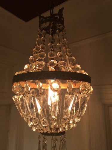
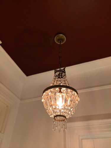
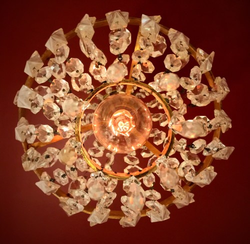
Then I turned to an alternative I don’t usually consider for vintage items, Etsy! Yes, that marketplace for crafts and handmade items now has a lot of great vintage things. While searching on Etsy, I came across Musette and Mimi online shop and found a perfect vintage 1950s French crystal basket lamp with just the right amount of patina.
This adorable chandelier is the jewel of the center hall, and the cottage red ceiling only enhances its elegance. You think?
I had initially looked at using a clear dimmable LED bulb, as we are trying to only use LED bulbs throughout the apartment, but this gem called for an old fashioned Edison bulb to bring out it’s beauty. So, until we come upon that perfect LED bulb, we will keep the dimmer low and allow ourselves this one incandescent exception.
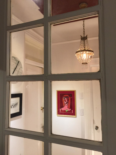
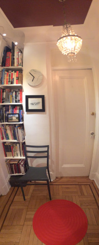
The shot above shows the view from our living room. You can see that the cottage red ceiling, the chandelier, and Lulu make for a very elegant combination. Below is a vertical panoramic shot of the entire east wall in the center hall. This gives you a good idea of how one side of the space turned out.
COMING SOON!!!!
The Big Living Room Reveal! Really!




Social