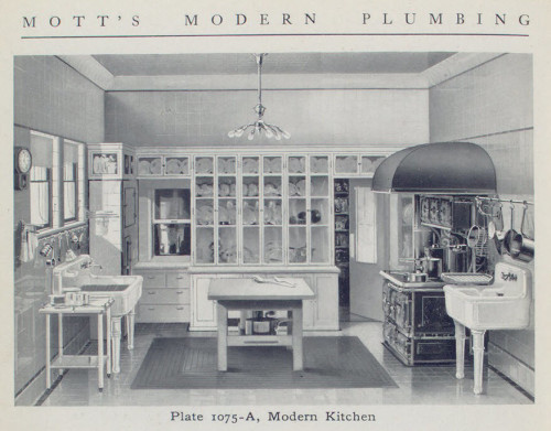
[Mott’s Modern Plumbing Catalog from 1910. This would have certainly been a fancy kitchen in 1910, but it is still quite utilitarian compared to the “Old World” style kitchens we see today. Image: NYPL]
Kitchen floors and walls….. Using common tile and elevating it to classy and timeless.
[Update at bottom] As the plans for our kitchen renovation are forming and the anticipated start date ofThis post is all about floors and walls. Or, walls and floors, as I am going to talk walls first.
Looking at historic images of what kitchens looked like at the time our home was built, it turns out that kitchens were very basic and more about function than aesthetics. They usually had a simple wood floor (sometimes covered in linoleum) or mosaic tile floor (think hexagon), a gas stove, large cast iron wall sinks, and a built in wood base cabinet with glass doored upper cupboards above. When it came to the walls, they were either painted plaster, covered in beadboard wainscoting, or sometimes tiled in white subway tile. Since our kitchen is in what was once a bedroom, we have the option of doing any of those things.
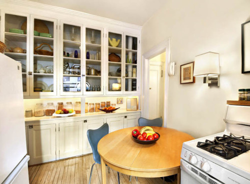
This is what the original kitchen in our apartment would have been like. This is a shot from an identical building built by the same developer in the same year as ours about ten blocks away from us. In our building, this portion of the original apartment became part of our next door neighbors after our apartment was split in two during the 1950s. I am completely envious of those original cabinets and wish I could recreate this in our space. [Image: StreetEasy]
The thing about basic 3×6 inch white subway tile is that it can be had on the cheap. I mean really cheap…. You can pick up glossy white (or black, or God forbid, bisque) subway tiles at the big box stores for as little as $2.00 a square foot. What you end up with is subway tile that looks like you spent $2.00 a square foot. I am going to splurge a bit and spend $2.59 a square foot (which is still really inexpensive in the world of tile) and go for a nice matte finished tile from Storka instead. Why matte finish? Something about the idea of walls of shiny glossy tile conjures up thoughts of an asylum.
![Inexpensive subway tile laid in a herringbone pattern is a great way to elevate a common material to a higher level while keeping it timeless and simple. [Image: Adrian Ramsay Design via Houzz]](https://halfclassicsix.com/wp-content/uploads/2015/07/Adrian-Ramsay-Design-Houzz-384x500.jpg)
Inexpensive subway tile laid in a herringbone pattern is a great way to elevate a common material to a higher level while keeping it timeless and simple. [Image: Adrian Ramsay Design via Houzz]
Moving on to floors… To catch you up, If you remember, last fall after the floor was repaired, I put down 6″strips of 1/4″ plywood and then painted the floor white. Well, you may not remember entirely as I never did a full post on it because as soon as we finished, we started to have second thoughts about our long term plans. At first this seemed like a good idea… Then we got Fritz, and as dogs can be prone to do, there is the occasional accident in the house. Fortunately, Fritz has managed to have his accidents in the kitchen about 90% of the time, but that means the kitchen floor must be more durable than the rest of the apartment. The reality is that a painted 1/4″ plywood floor isn’t very piddle proof. Also, after living with it for the past nine months, the floor isn’t holding up quite the way I had hoped. So it is looking like we spent $400 on a floor we are now going to pull up and get rid of. Not ideal, but sometimes no matter how much we plan, we discover in hindsight that our plan has unforeseen flaws.
So now that we have decided we need to pull the 1/4″ painted ply up (and the 1,000+ nails I shot into the floor to hold it down), our decision on material was pretty simple…. Ceramic tile. Many of my Facebook friends will remember this past February when I posted the shot below of three different tiles asking for favorites. It was overwhelmingly mixed.
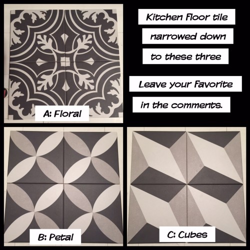
In February, we fell in love with these Merola Tiles from Home Depot. We asked for feedback from our Facebook friends and the votes were all over the board, but B: Petal was the winner overall.
We kept the three sets of tile on the floor of the kitchen for the next couple of months walking by each day and seeing which one we felt was the one we could live with for the next 25+ years and by the end of April, we realized we couldn’t see ourselves living with any of them. Then after hours and hours of pouring over hundreds (thousands?) of images of tile floors on the Googles and Pintrests, we kept coming back to the very humble and simple hexagon mosaic. A tried and true floor material which is impervious to doggie accidents, will never look like it is stuck in any time warp (other than perhaps when the building was built, which is OK), and it’s cost effective. That said, as much as I want to go with the tried and true, I still need to do in a way that isn’t quite the same as everyone else (which basically describes the entire path of my life).
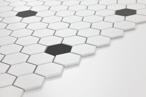
We are going to keep it simple with a white hexagon tile field and black accent tiles in low key pattern….. The big difference is that we are going to do this using 2″ hexagon tiles instead of the traditional 1″ or .75″ tiles which I feel are too small.
So there you have it…. Walls and floors, floors and walls. Subway tile and mosaic hexagon tiles are both very common materials, but used the right way, they can be elevated to higher class and remain timeless. Hopefully when I look back in 10-15 years, I can say that I feel the same way.
There are two more parts to this series. One focusing on the details and accessories (sinks, faucets, hardware, etc…), the other is how all of the elements are expected to come together to create our awesome new kitchen. Now that we have officially delayed the start of the kitchen to the fall, expect to see the final two parts before we kick off the renovation sometime in late October. In the meantime, there are other happenings going on with the apartment, including a very exciting reveal coming up in the next few weeks.
| Update: December 2015: The floors and walls discussed in this post changed (again)… We decided to ditch the herringbone subway tile on the walls (read about what we did here), and we also decided to ditch the hexagon tile floor and follow our hearts by choosing a flooring which makes hour hearts sing. |



Social