OMG…. It’s really been a month since my last post? I guess it has….. Although I did take a bit of a break after finishing the living room, we have been hard at work figuring out the details of our next (and biggest) project…. The kitchen….
I haven’t written about it since my January post about being devastated by IKEA’s silly decision to dumb down their cabinets for the North American market (sorry Canada). And before that I wrote about wanting black cabinets which of course, I no longer want black cabinets. When we moved in last September, our kitchen looked like a suburban storage locker. But by October, we had a plan… Or so we thought we had a plan… then plans change.
I would like to say it doesn’t look like a storage locker now, but in some ways it most definitely still does. About 1/4 of the space is still piled high with boxes, and the rest is a mismatched hodgepodge of cabinets temporarily set up combined with a new stainless steel side by side, and fabulous range. What started out as a plan for a five year kitchen to hold us over until we can do our real dream kitchen shifted to a very temporary kitchen intended to carry us through our first year. We are now in the planning stages of doing our sorta dream kitchen now, not in five years.
I say “sorta dream kitchen” because like most things in life, it will be a compromise between my somewhat expensive dreams and my budgetary reality. The next several posts will be about our plans for our sorta dream kitchen. But before getting into what we are going to do, I thought I should share the inspiration from which we are making our plans.
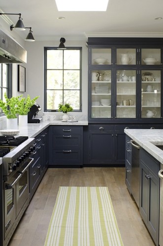
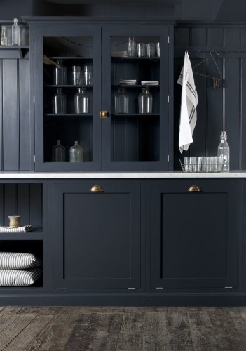
The kitchen at the top of this post is one of the earliest inspiration images we came across last year when we began to dream about our future kitchen. But before diving into our inspiration kitchens, a bit of what we are trying to achieve. We have long decided that we want our kitchen to look as good in 20+ years as it will when it is completed later this year. So many of the kitchens we saw in those fifty open houses we went to before finding this apartment has kitchens stuck in a time warp (think of those hideous Euro cabinets installed in kitchens across America in the 1980s, ugh). Fortunately, I was ready and willing to tackle a new kitchen in virtually any place we saw anyway.
So basically, this means what ever we do, I don’t want people to walk into the kitchen in ten or twenty years and say (in their heads) “This must have been lovely in 2015 when it was last updated”. Being a modernist at heart, I love starkly modern kitchens. I also love the contrast of starkly modern embedded in an old traditional space…. But not in this kitchen. We want it to feel elegant yet simple, clean yet interesting, modern yet traditional, luxurious, but not over the top. We want to use materials which existed in 1910, but in a slightly different way than expected. We want it age gracefully, and beg the question, “Is this original, or was this added?” If I want our kitchen to have a timeless feel, I need to use traditional materials, and take into consideration the space it is being built into. But that doesn’t mean it won’t feel contemporary.
Okay, enough with the words, let get to pictures and start with a few kitchens I love…
This is an absolutely beautiful kitchen. I am loving the double row of upper cabinets which are beautifully painted in Down Pipe from Farrow and Ball (as is the ceiling). Although I like the butcher block counters, I am not sure they are the best choice… But I am thinking there will be butcher block in the kitchen.
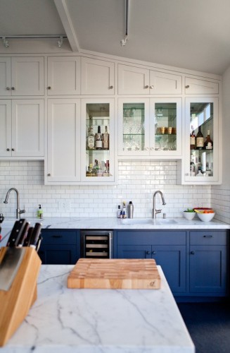
We both love this San Francisco kitchen…. Especially the blue lower cabinets. There are a lot of elements we hope to incorporate into our kitchen including the glass upper cabinets and subway tile. I also think it is fabulous that they took the time to design the upper row to fit within the angle of the ceiling.
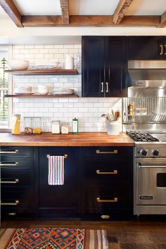
I have never been a fan of brass, but it just looks like it belongs in this Brooklyn kitchen and the overall idea of brass cabinet hardware seems to be the direction we want to head in our kitchen. Although we will however, not be buying a Viking range anytime soon.
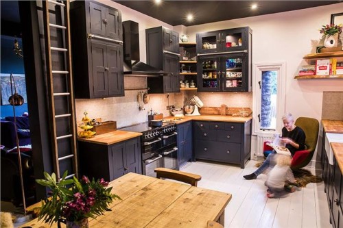
What is it about British kitchen design? I am completely in love with the shaker kitchens produced by Devol Kitchens UK. They are so beautiful in their simplicity, offering very traditional design, yet with a contemporary feel. This utility room (by Devol ) just makes my heart sing…. so lovely! Not quite black, this charcoal color was a contender for us, but ultimately too dark for our kitchen, but so inspiring. I love the dark cabinets, and again with that brass hardware! If only they were a bit more affordable and locally made.
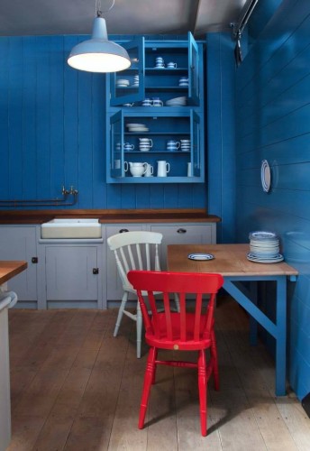
Again, another British kitchen. This time by British Standard. They have some of the most simple yet beautiful designs for kitchens, especially this black and white stunner. This blue, and gray kitchen is marvelous! Of course as much as I love that red chair, it is the beautiful blue that I am drawn to in this display kitchen.
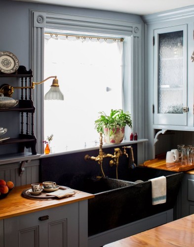
I found this kitchen when perusing a New York Times feature on a home in Bedford Stuyvesant from a few years back. It is not quite what we are going for, but I am in love with the overall look. Especially the textured glass in the cabinet door as well as the double soapstone sink and brass fixtures (which are out of our budget).
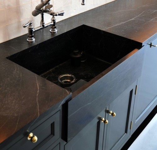
Soapstone counters…. Love them! But I also love white marble counters…. This decision has been complicated by the fact that my amazing husband is very concerned about stains on a white marble counter-top… but more on that in a future post. Looking at the shot above, I love this whole set up with the soapstone counters and integrated sink, the dark cabinets and brass hardware. I unfortunately don’t think the farm house sink will work for us given that our sink is only inches from the wall in a corner, but perhaps a black under-mount will give the same feel?
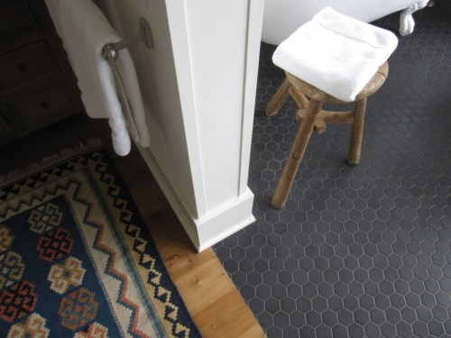
OK, so this is not a kitchen…. But that floor is really beautiful! Two inch matte black hexagon tile…. We have spent entire evenings looking at tile on the Internets. We started out with patterned tiles, but became concerned about them becoming too dated in the future. I love the look of traditional hexagon tile floors, but I feel white hexagon tiles are just a bit too pedestrian for us. I want something that feels like it has always been there, but fresh at the same time. In doing a Google Search, I found several bathrooms with this black 2″ hexagon tile floor, but not a single kitchen. Why not use it in a kitchen I ask?
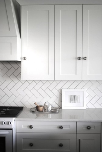
There is too much white going on here, I am not a fan of white on white on white on white on white….. But the herringbone tile on the wall is absolutely amazing… This can be done with inexpensive 3×6 inch white subway tile you can pick up for a quarter a piece at the big box store (if you don’t mind glossy tiles). However, my preference is to order matte finish tiles for about the same price online from someplace like South Cypress.
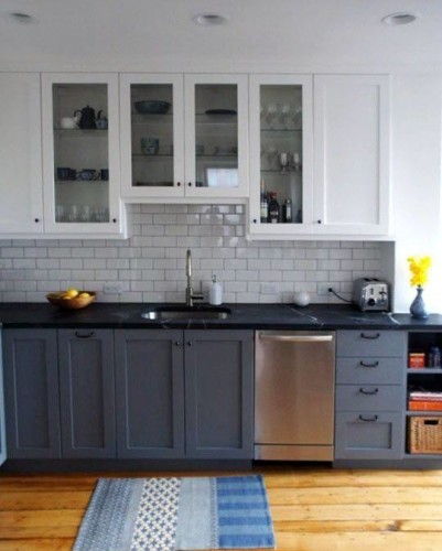
Apartment Therapy featured the full renovation of Dan Bailey’s Boston kitchen last year. As it turns out, there are a few things here that we will likely be using in our kitchen, including the cabinet style, black soapstone counters, and yes… Subway tile. although I am not a big fan of the two toned cabinet trend, there is much here which we plan to incorporate into our kitchen.
So, there you have it….. You can see there is a theme starting to go on here… Blacks, whites, blues….. Shaker cabinets, glass cabinet doors, soapstone counters….. Subway tile, brass hardware, butcher block… All together…. Beautiful!
Next up…. I plan to break down our plans over several posts throughout the month of June and into July, detailing how we arrived at some of our decisions and material choices. After that we hope to begin the work on our sorta dream kitchen in earnest and I hope you will join us for the ride.



Social