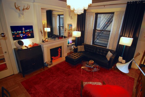
OK, I know you all have been patiently waiting with baited breath to see the living room in all its glory….
OK, I know two or three of my readers have been patiently waiting with baited breath to see the living room in all its glory….
Well, finally….. The living room reveal is here. But first a few thoughts and a bit of background….
First, my style…. I have written about it before, but I would say that my style is definitely in the realm of Eclectic, with doses of Traditional, Mid-century Modern, Contemporary and Modern. I have a strong appreciation for the classics, I still love my modernism, and I am not afraid to mix things up. I also like to think of our home as a curated collection of things that speak to who we are. Yoav lets me lead the way on the design, but his opinion is always consulted, and anything he is strongly against is out.
If you will remember where we started way back last year (first walk through video), you can see that this is a HUGE transformation. Before we moved in and then in the months following, Yoav and I contemplated various ideas and color schemes for the living room. First it was various shades of gray… Then large vertical stripes in various shades of gray… Then horizontal stripes in various shades of gray. But in the end, I went with my gut and found the courage to do the look we have now resulting in virtually no gray at all. None of the variations previously considered incited as much excitement and exhilaration for both of us as the final look we have achieved.
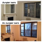
Remember this shot? The burglar bars were put in back in the 1970s when the neighborhood wasn’t the utopia it has become today. A grim reminder of where we started.
But, before we get into the details, let me first talk about what we are starting with. The room is about 14′ x 18′, with 9′ 9″ ceilings. Quite decent sized by NYC standards. There are two French doors, one leading to the entry (gallery) hall and the other to the center hall. The focal point of the space is the large original decorative fireplace (it was always decorative) with the original 4′ x 4.5′ mirror. The room once had very elaborate moldings
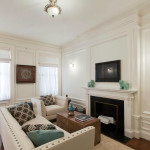
This is a living room in another building by the same architects as ours. The molding and trim work are exactly the same as what was once in our apartment. We still have our mirror which is far better than the flat panel TV.
(exactly like the apartment pictured to the right), which were unfortunately stripped away in the middle of the last century when they sliced the apartment in two (hence my blog title). Gone are the beautifully coved plaster ceiling and crown molding. Gone are the 18″ tall baseboards. Gone are the heavy panel moldings on each of the walls. But with all that was stripped, we still have the original door trim, the window trim, the fireplace mantel, and best of all, we have the original quarter-sawn oak parquet floor with mahogany borders. It was these underlying bones that sold us on the apartment.
The biggest challenge is that the room is somewhat dark. The very large window looks out into a “courtyard” directly at our neighbors on the other side of our building, so there is no view unless you stand in a certain place and crane your neck to look out the window. Add to that the large fire escape attached across the entire window. Not very grand really (although VERY New York). Meanwhile, our bedroom and kitchen (which was formerly the other bedroom in the original apartment) have lovely views looking out over the street, with lots of sunlight and fresh air.
Why the hell did they do this? A little bit of history will explain why these challenges exist. I came across a New York Times article “Many Innovations in Apartment Houses” from August 22, 1909, the year before our home was constructed. The article described the then current trend of having the public rooms take a secondary role in the home. First there was the “fresh air” craze at the time. The thought being that placing bedrooms on the outer walls of a building afforded them cleaner, healthier, fresher air. Then there was the concept of privacy. People were very private at that time and builders learned that separating the sleeping chambers away from the more public spaces afforded a stronger sense of privacy, more like a traditional single family home. All this makes sense, but the idea I found most interesting in the article was this: “This tendency (to make public spaces secondary to bedrooms)…. is due to a large extent to the fact that people have grown better educated and more cultured, and can find better employment for the time they spend in their parlors than that of looking out of the windows upon the happenings in the street.” My guess is that they didn’t want the people of means to need to look out onto the street and see the people of much lesser means passing by.

Our building has but one staircase, but with marble steps and two stained glass windows at each landing, it is a beautiful staircase.
So that explains why our fanciest room has the worst view. Oh, and then there is the fire escape…. When the building was completed in 1910, there was only a single (unenclosed) staircase in the center of the building for means of escaping in case of fire or other emergency. It is a very beautiful double staircase with leaded glass windows on each landing, but basically that means if your apartment is on fire inside your front door, you are screwed. Then less than a year after people were living in our building, the Triangle Shirtwaist Factory Fire happened. One of the deadliest industrial disasters in New York history. Suddenly, fire safety was an issue and building owners were forced to install external metal fire escapes to allow for a means of egress in a fire. As such, we now have a giant fire escape in our living room. Of course, I am not sure what we would do if there was a fire in the living room as the bedrooms have no means of escape. Fortunately, were are on a low enough floor that the hunky firemen could rescue us via hook and ladder truck.
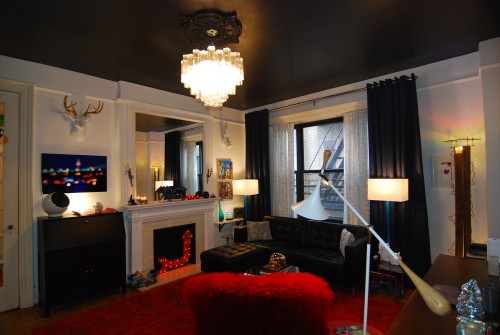
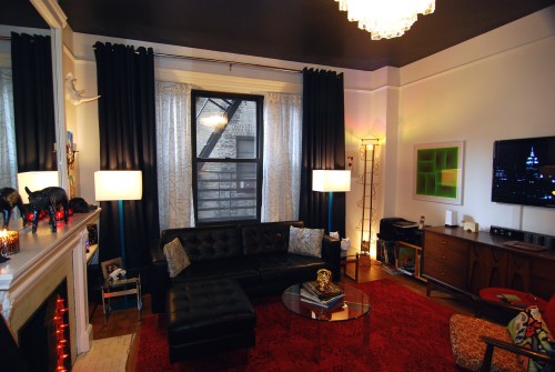
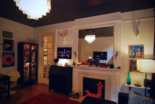
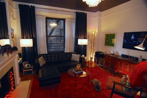
Okay, enough about the history and how the room came to be as it is now. Lets get on with the reason you are here…. Interior design is an evolutionary process and is never actually done. There is always the initial big push to get the majority of a room done to make it habitable, followed by long term fine tuning. There are also future plans for enhancements further down the road. So with that, here is our Version 1.0 of our living room. Now the pictures! (Click on any one of them to open the slide show view)
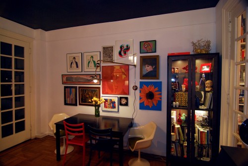
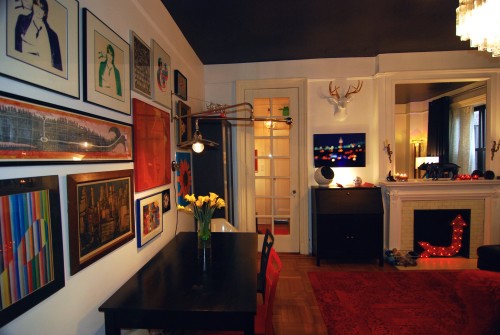
The wall mounted swinging arm lamp carefully positioned on our art wall is a brilliant solution for when we have eight people over for dinner and need to pull the table away from the wall… It just swings out to where we need it.
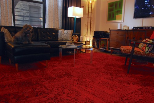
I love this rug because it is old and new at the same time. Fritz insisted on being in a few of the shots (how could I say no?), Yoav chose to remain on the side lines.
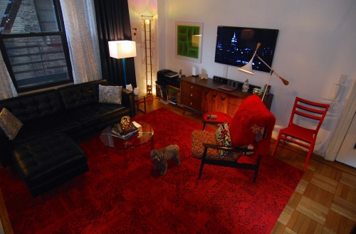
A view from the center hall, photo bombed by our little Fritz. The stunning wood floors are apparent on the right. Playing on the TV is “Ode to Andy”, a video I put together last summer after a visit to a friend’s roof top in Chelsea.
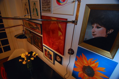
Our art wall was put together using pieces we both had before meeting, along with a couple of pieces we bought together, and a couple of pieces which belonged to my best friend who passed last year. The Babs is one of our favorites. We picked it up at a street fair in Hell’s Kitchen for next to nothing — turns out is by a known artist frequently found on eBay. The sunflower was painted by myself back in the mid 90s, The whale was produced by the MTA as subway art back in 2001. Oh, and that is a pair of Shaun Cassidy silkscreens by Yoav.
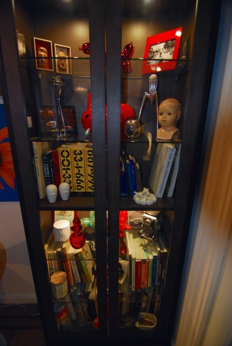
Everybody needs a cabinet of curiosities. I envision this will become more filled with our future obsessions.
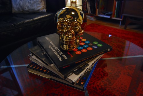
The ever changing stack of coffee table books guarded by our golden skull. (The book on the top is one of my favorites, I am such a Geek!)
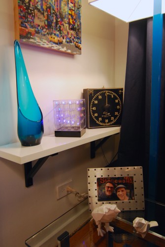
Area to the right of the fireplace. Vintage laboratory countdown timer found on our recent trip to AZ.
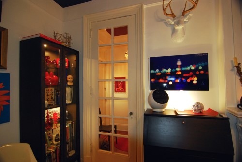
Looking into the center hall, Lulu in the background. The drop front desk is where my husband works. I schlep to the office, he gets to work in a beautiful room.
We are far from done (there is still much woodwork to be painted), there are plans to install appropriate crown moldings and replicate the 18″ tall baseboards in the future. But for now, we have a working, functioning, and (I think) a very beautiful version-1.0 living room to relax in.
Feel free to chime in with your thoughts… Tell me what you like and what you hate (it’s OK, I can take it).
Resources:
- Paint: Benjamin Moore; Walls – Chantilly Lace White, Ceiling – Onyx Black
- Tronchi tube glass chandelier: eBay
- Red rug: “Chenille Charade” in Persimmon by Flor
- Leather sofa and ottoman: “Karlstad” from Ikea with replacement legs from tablelegs.com
- Coffee table: Aluminum base – eBay, Glass top – Pier 1
- Chrome and glass side tables: eBay
- Lounge chair: Vintage 1960s Baumritter chair in walnut: eBay
- Credenza: Vintage 1965 Broyhill Brazilia in walnut on eBay
- Floor lamps by sofa: CB2
- Floor lamp by chair: JC Penny – Terrance Conran Collection
- Torchère floor lamp (corner): Yours truly, built for a design competition in 1991, Portland, OR.
- Red side table: MoMA Design Store
- Dining table: Ikea (1990s vintage)
- Burke fiberglass dining chairs vintage late 1960s: Craigslist
- Dining chairs: Sabrina Chair – Room and Board
- Wall mounted lamp over dining table: Restoration Hardware
- Secretary desk: Ikea with updated hardware
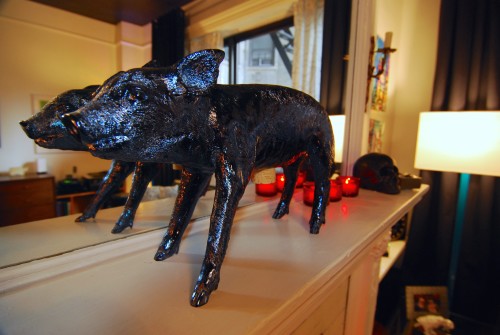
- Percy the Pig: Areaware via fab.com
- Milton the Golden Buck: fab.com
- Ronny the Rhino: Z-Gallerie
- Silver skull: Z-Gallerie
- Gold skull: Pearl River Trading Company
- Glass display cabinet: Ikea



May 5, 2015
It’s very glamorous and warm. Congratulations!