Hi folks! I am still here! Yoav and I just got back from a much-needed vacation in Arizona (my first time traveling more than 100 miles from NYC in 19 months!). Now that we are back, we are getting full swing into working on the apartment. Each weekend is devoted to projects, sometimes one big one, sometimes lots of small ones. We have much to write about and reveal, but all in due time as much of what we are working on is still in progress. But I promise some super amazing stuff soon…. In the meantime, here is an update on one of my favorite spaces in our apartment, our center hall.
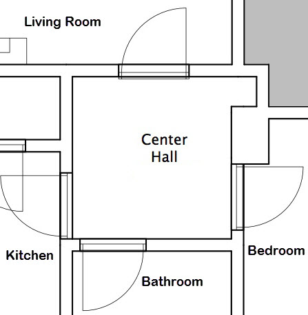
This is our Center Hall and it connects with the Living Room, Bedroom, Bathroom, and Kitchen. It also features a nice little niche with some shelves.
The space is about five and a half by six and a half feet, has four doors (living room, bedroom, bathroom, and kitchen), there is a niche in one corner where somebody many decades ago installed some shelves, and a beautiful coved plaster ceiling. I love it because it is virtually a room unto itself and wonderful presence.
The space is separated from the living room by an 8′ 3″ tall French door and when the apartment was built, it was intended to be the transitional space between the public space and the private space (the current kitchen was originally a bedroom). The doors to the other three rooms are pretty basic, we removed the door to the kitchen as it seemed unnecessary, but both the kitchen and bedroom doorways retain their original transom windows, albeit under may coats of paint (future project).
Our apartment was built in 1910, and has always (with one exception) been a rental unit, even long after converting to coop in the 1980s. The one exception being the last owner who was a student at Columbia for a few years, used the place as a crash pad, and then rented it out again. As such, it has suffered from lack of care in a lot of areas. It has also suffered from random paint colors and finishes being applied wherever they seemed to be needed at the moment. This is how our center hall ended up with four shades of white, varying from bright white on the ceiling to ivory on the walls. Why it is that landlords feel the need to make their spaces so ugly I will never know, other than the fact that they just don’t care. Why landlords think that ivory is a good color to paint a space which has limited light is another mystery I will never understand. Ivory is a color that only looks good on tusks, not walls.
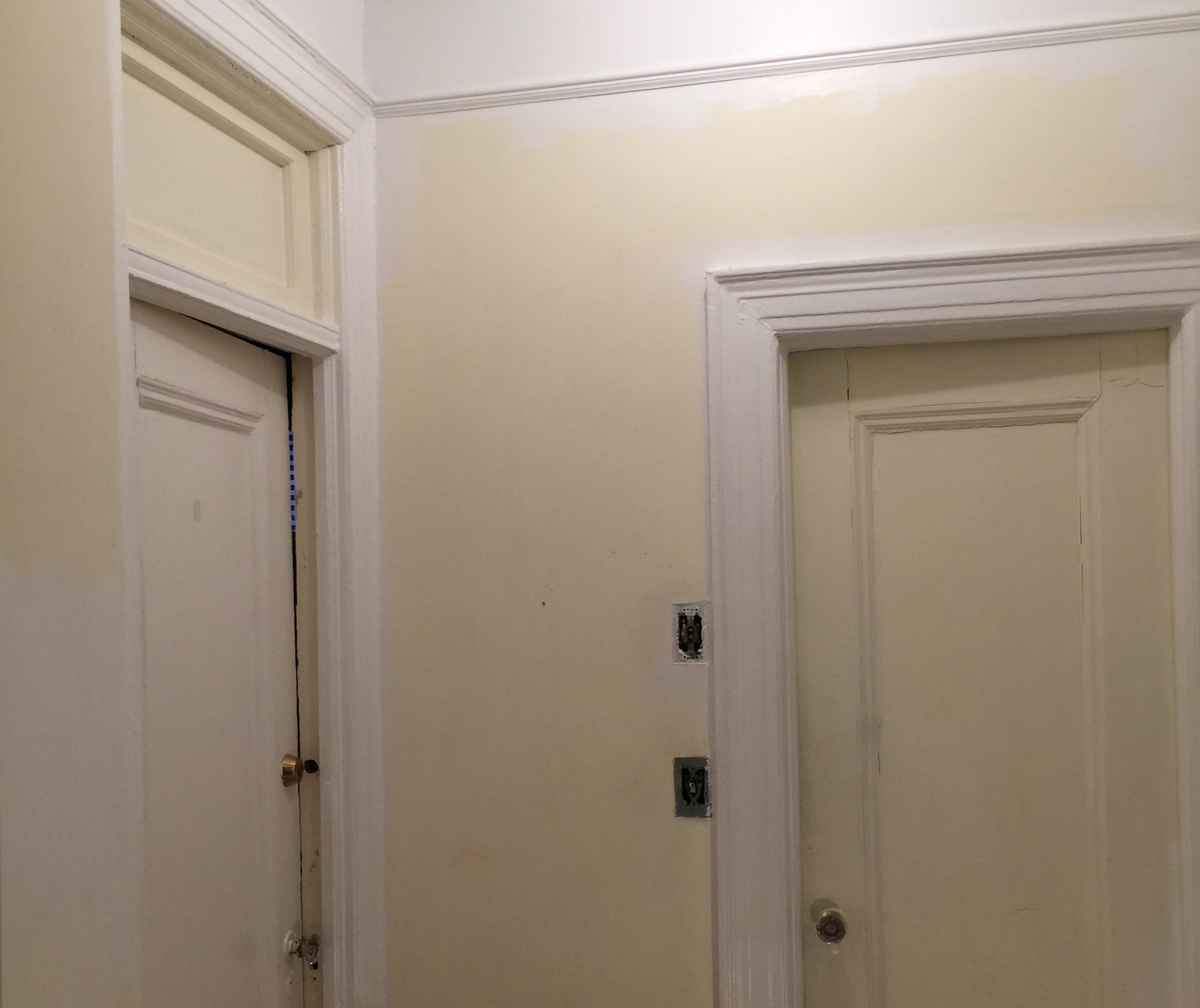
Trim painting in progress. I am still overwhelmed by ivory walls! Ugh!
So this past weekend, I tasked myself to paint the center hall top to bottom, using the brightest white Benjamin Moore available, Chantilly Lace (2121-70) in both eggshell and semi-gloss. As is the case with any painting job, the preparation often takes as long as the actual painting. I spent much of the day Saturday preparing, taping, sanding, etc… and then did two coats of semi on the trim, shelves, and the plaster cove detail above the picture rail. Then on Saturday evening, I did the first coat of eggshell on the walls.
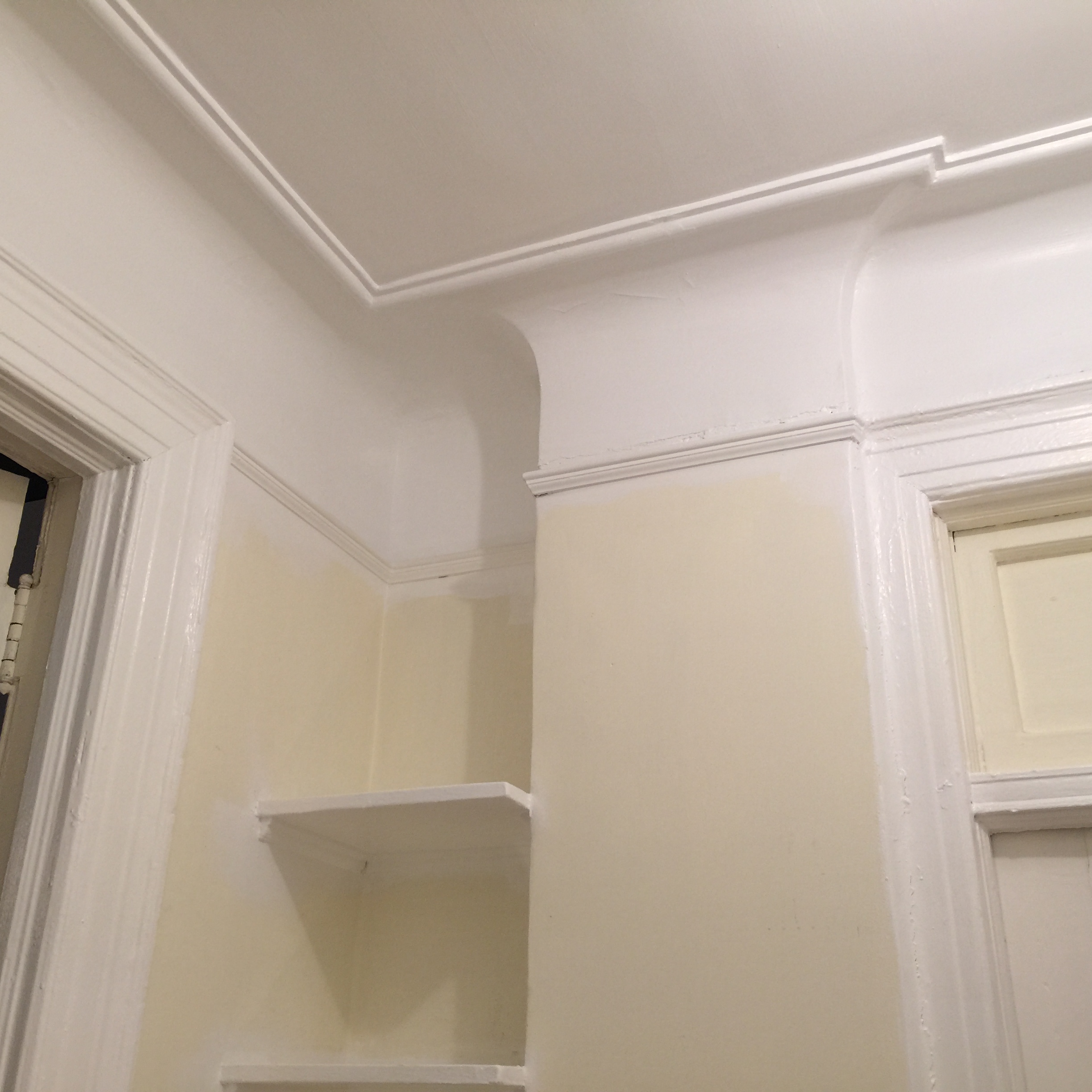
Trim and plaster cove freshly painted in Benjamin Moore Chantilly Lace White.
On Sunday, I awoke hoping I could get away with just one coat since I was essentially doing white over ivory, but with the lights up bright, I could clearly see that buried in the brightness of the Chantilly Lace White was a tinge of ivory (again I ask why ivory?) So I did a second coat and this seems to have solved the problem. Meanwhile, in the early afternoon, Yoav was reading in the living room (or was he just catching up on Facebook on his iPad?) and I decided that I needed to paint the ceiling something bold. We had already discussed painting the ceiling, but hadn’t come up with a color. Earlier I was poking about my tool/junk closet and ran across a can of paint on the paint shelf and the idea popped into my head to use this paint on the ceiling. The color?
Apple Red….
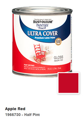
The horrible color choice for the ceiling (WTF was I thinking?)
By now it is pretty obvious that my favorite color is red. I have however through trial and error, learned that red is also very strong and must be used carefully. I have made the mistake of painting entire rooms bold bright red and later realized that it was too much (I then also have had the experience of needing four or more coats of primer to cover the red followed by white to get my deposit back on my apartment. I have learned that it is absolutely appropriate to use red, even large areas of it, but it must be balanced.
Back to my center hall…. I stood there with the quart of high gloss Apple Red and thought, “This would look amazing on the ceiling!” So while my very understanding husband was reading on the sofa, I popped open the can of apple red paint and began to paint the ceiling area inside of the plaster detail. Let’s just say it was BOLD.
With only a single coat of paint up, we both stood there and I spoke what he was thinking… WTF have I done? This looks horrible! It was totally overwhelming and in his words, very “college dorm room-ish”. The ceiling felt as though it was going to descend upon us every time we walked through the center hall. It was so bad, I actually have no pictures of it. It became immediately clear that a second coat was not going up and I was trying to figure out what to do to make this go away as quickly as possible.
Wow, we both just love this so much! (The ivory remains on the transom window as an incentive to strip the paint off to reveal the textured glass window.)
I then remembered a sample can of paint we had purchased for a different space which we hated when we tested it out…. But perhaps it would alleviate the overwhelming red I had slathered on our ceiling. While Yoav was taking a nap, I pulled the sample can out and began to cover the apple red. What started out as a quick fix until we decided on what we are going to do was actually beginning to look really nice up there…. Actually it was looking quite amazing! Shortly after I began to cover the hideous red, Yoav stepped into the hall and exclaimed “Wow! This is fantastic!”
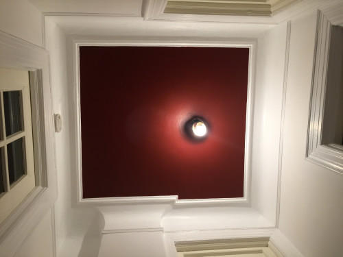
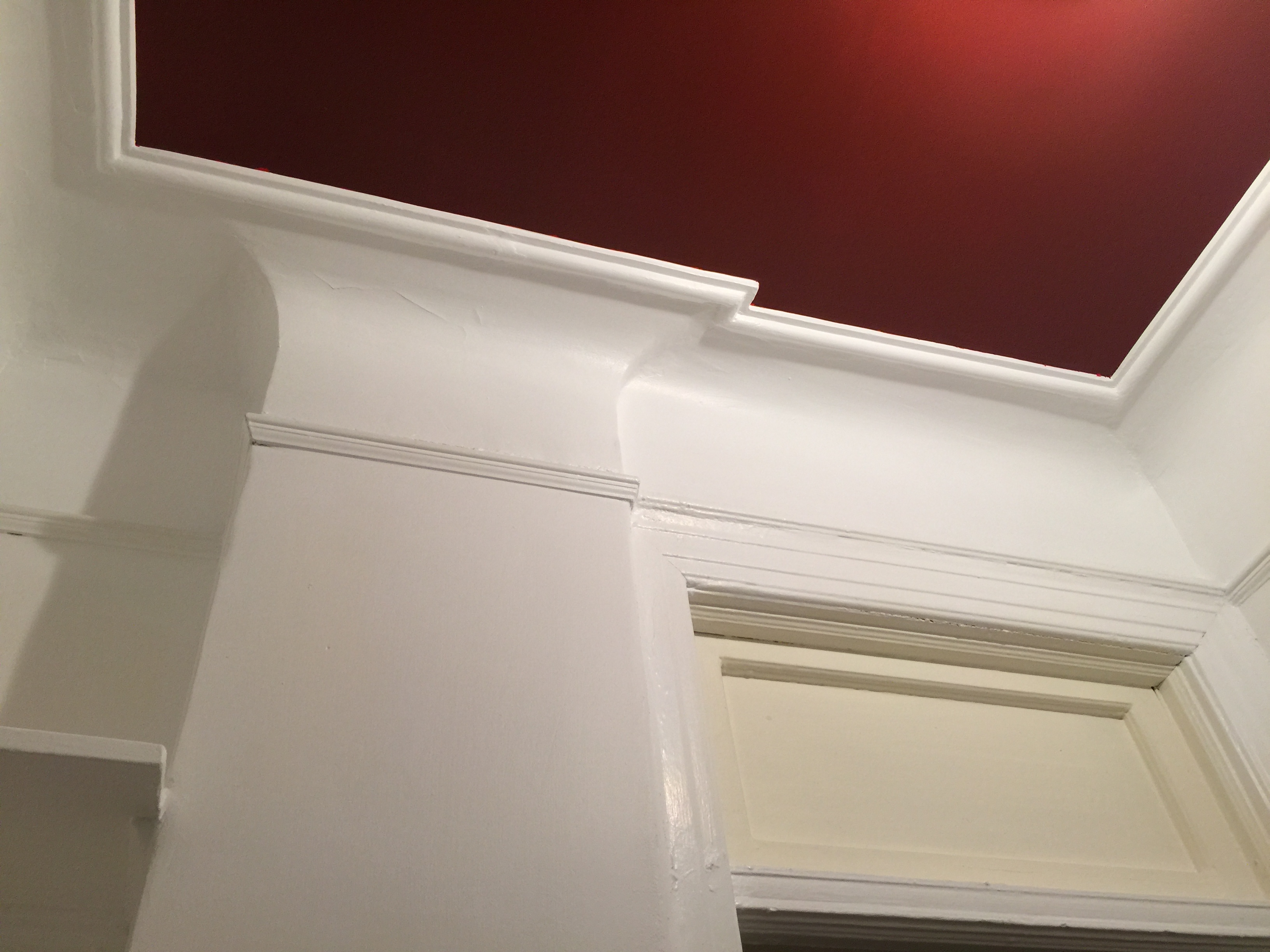
The color? Red of course, but this time it was Benjamin Moore Cottage Red (PM-15) from their website: “A deep red, this concentrated shade has a sultry, somewhat moody side.” It is totally dark moody red and when paired with the stark bright Chantilly Lace White, it is absolutely the perfect shade of red.

Benjamin Moore Cottage Red Ceiling as seen from the floor looking up.
So there you have it…. The walls and ceiling in the center hall are done! Yay! We have items on order, lighting to install, art to hang, and shelves to fill…. That will be part two. Stay tuned!

Eeek! What was I thinking?
Footnote: I didn’t take any pictures of the hideous Apple Red because I was so distressed at what I had done…. However when I pulled the tape from the Cottage Red, a small peep of the Apple Red showed up, you can see it in this image I shot before touching it up.


0 Comments