
“You say “Stiffkey”, “I’ll say Stewkey”. . .
Those close to me know that I have been obsessing over our kitchen design for months, and months, and months, and…. you get the idea. And in doing so, I have discovered that what I thought I liked three months ago may not be what I like today. As I have delved deeper and deeper into the possibilities of what we can do, I have made surprising discoveries about my taste and desires for the new kitchen.
The next several posts are about the various elements going into the new kitchen, as well as my process and how I have arrived at what I believe will be an amazing kitchen in the end. Although you can be sure that by the time we implement our plans, something will change yet again.
First up, let’s discuss cabinets!
Initially, we thought we would just go with Ikea cabinets because they are built well, and we can afford them. Then in January after Ikea introduced their replacements for their AKURUM cabinets, I kvetched about how Ikea had “dumbed down” their new SEKTION kitchens for the North American market. I was sorely disappointed, but still thinking there must be a way to incorporate the simplicity of the Ikea cabinet system into my plans. After spending months looking at what is available here in the US, it makes sense that the kitchens which I find the most dreamy are nowhere to be found in North America (Shocking!). That said, that post about my frustration with Ikea turned out to be a blessing in disguise as you will see in this post.
I have previously stated (many times) that I am a modernist at heart. I. LOVE. MODERN…. Given how much I love modern, you would think that those amazingly beautiful, sleek, and modern kitchens of Italy (and their requisite Ikea comparables) would make my heart sing, and they do to a certain extent. After all, I love the idea of mixing very modern within a very old space. But looking at our home, sleek modern Italian design is not what our kitchen calls out for. Not even in the slightest bit.
It turns out the look I (we) are aiming for, simple, clean lines, and contemporary, is also much more traditional than I would have ever expected. I want a kitchen that is current, yet still timeless, made with materials which could have been used in 1910. So oddly enough, the kitchens which make my heart sing are really quite traditional and surprisingly old fashioned. Not at all what I would have expected. Add the fact that by Manhattan standards, we have the privilege of having a rather large kitchen measuring about 11’x15′ (because it was originally a bedroom), and even though it was not built as a kitchen in 1910, but I really want it to feel as though it has been there all along with only minor upgrades. I want you to come into our kitchen and not know what’s new and what may be original.
This brings me to what kitchen styles make my heart sing…. In my endless hours of perusing the Interwebs, I have fallen in love with the old-timey styles originating from the United Kingdom. I am completely in love with their simplicity, style, and use of materials. Classic, traditional, but somehow modern. There are lots of British companies which make amazingly beautiful kitchens. Three of the ones that I particularly like are; British Standard in London, deVOL in Coates, and Naked Kitchens of Fakenham.
![British Standard Kitchens [UK], Black and White Fabulocity!](https://halfclassicsix.com/wp-content/uploads/2015/06/BritStandard-01kitchen02.jpg)
British Standard Kitchens [UK], Black and White Fabulocity!
![British Standard [UK], Black fitted customer kitchen with cupboards.... So beautiful!](https://halfclassicsix.com/wp-content/uploads/2015/06/BritStandard-CaseStudy02.jpg)
British Standard [UK], Black fitted customer kitchen with cupboards…. So beautiful!
![deVOL Kitchens [UK], Charcoal cupboards with marble worktops.](https://halfclassicsix.com/wp-content/uploads/2015/06/deVOL-Kitchens-Clerkenwell-Showroom-Shaker-5.jpg)
deVOL Kitchens [UK], Charcoal cupboards with marble worktops.
![deVOL Kitchens [UK], Fitted Shaker style pantry and cupboards](https://halfclassicsix.com/wp-content/uploads/2015/06/deVOL-shaker-fitted-pantry-cupboard1.jpg)
deVOL Kitchens [UK], Fitted Shaker style pantry and cupboards
![deVOL Kitchens [UK], Shaker kitchen in Bath, England](https://halfclassicsix.com/wp-content/uploads/2015/06/deVOL-01-shaker-bath-kitchen.jpg)
deVOL Kitchens [UK], Shaker kitchen in Bath, England
Naked Kitchens [UK], The West Hampstead Customer Kitchen
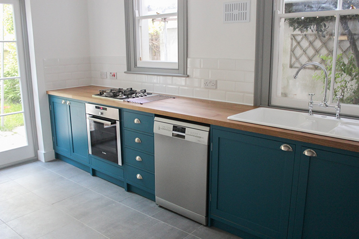
![Naked Kitchens [UK], Stiffkey Blue island sink and counter](https://halfclassicsix.com/wp-content/uploads/2015/06/NakedKitchens-01-Stiffkey.jpg)
Naked Kitchens [UK], Stiffkey Blue island sink and counter
My next quest was to see if I could find a cabinet company in the US that had something similar and within our budget. Well, it does turn out that there are a couple of companies which make cabinets in a very similar style, but they are strictly custom and come as a price that would be 3-4 times the cost of the British cabinets… Definitely not in our budget. This leaves me with no option but one of compromise.
After my January fit of anger at Ikea about dumbing down their new cabinets for the North American market, followed by my falling in love with British cabinets I cannot have, I stumbled across this post on Remodelista. It was about a company called Semi Handmade Doors in California which makes custom cabinet doors designed specifically to fit Ikea cabinetry. That’s when the light-bulb lit up…… I suddenly realized that although I had to let go of the dream of “in frame” cabinets… I can have cabinets that I love, and won’t look like they came from either a big box store or off the sales floor at Ikea.
This blog post on Remodelista was my entry point into the world of alternatives for Ikea kitchens.
Ultimately, there are five big benefits with going with Ikea and Semi Handmade:
- Ikea cabinets are well made and feature Blum hardware (the same hardware used in most high end Italian kitchens)
- Ikea is the only known source for cabinets where they will sell you the frames, drawers, inserts, and hardware, but not make you purchase the doors.
- Ikea cabinets have a huge advantage in that you can outfit them with custom interior organization options (just like the fancy Italian cabinets) that are either not available at the big box stores or are hugely expensive.
- Semi Handmade doors are available in unpainted “DIY Shaker” style, allowing us to paint them in the color of our choice, rather than be stuck with the much less interesting black, white, or gray. This will set them apart from the standard Ikea doors as well as the big box stores which is a huge bonus! Semi Handmade also can provide coordinating end panels custom sized for our needs, further adding to the custom feel of our kitchen.
- It turns out that by us purchasing unfinished doors and taking on the task of painting them ourselves, we can actually end up spending less than the most similar door design at Ikea (Laxarby).
Here are a few more examples of Semihandmade kitchens with painted DIY Shaker doors:
This is the same kitchen I posted (different angle) in my last post. A great example of using Ikea cabinet shells and custom Semihandmade doors.
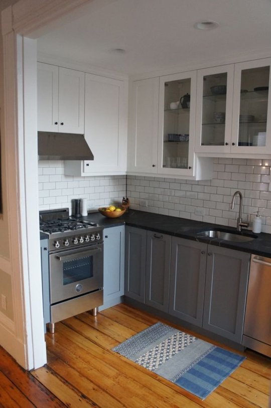
Los Angeles kitchen featuring Ikea cabinet shells with painted DIY Shaker Semihandmade Doors. Not the most interesting kitchen, but lovely none the less.
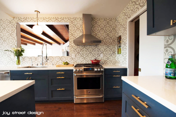
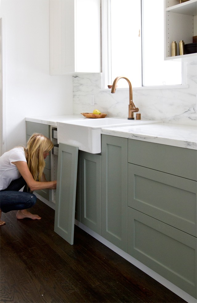
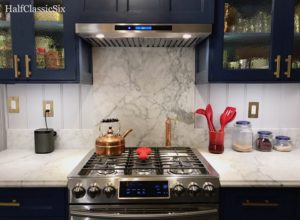
There is a lot to love about this Boston kitchen featuring Ikea cabinet shells with painted DIY Shaker Semihandmade Doors. Of course the marble counter tops, brass hardware and dark blue cabinets are hitting all the right notes for me.
So, as you can see from the examples above, going with Semihandmade Doors presents an opportunity to go with any color we want because we are doing the labor of priming and painting the cabinets ourselves.
| UPDATE: 11/04/2015: After many months of just not being happy with trying to force IKEA cabinets to fit within my space, I discovered another option which will provide a huge upgrade to my IKEA plan. Read about it here: Rethinking the Kitchen |
This brings me to the opening paragraph of my post. Remember at the beginning of the post I mentioned that the more I obsess over the details, the more I find what it is that I love? Yoav and I started out with the idea of gray cabinets which then shifted to black cabinets, which shifted to charcoal gray cabinets, which shifted back to black cabinets…. Well, you get the idea…. I kept coming back to black cabinets with white marble counter-tops because I just felt they were so beautiful….. But I also kept seeing them on all the design blogs, which caused me to ask myself. “Am I loving them because this color scheme stand the test of time and look timeless in 20 years? Or, because they seem to be trending quite a bit lately?”
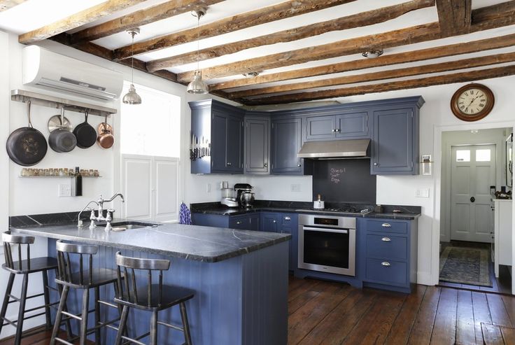
This blue kitchen was the kitchen which started my obsession with the idea that cabinets can be other colors besides black, gray, or white, and still remain timeless in design.
Then sometime in early April, I noticed that I was really drawn to the color blue, specifically darker blues, especially after seeing this kitchen on an Apartment Therapy house tour. Shortly after I stumbled on this kitchen, I quickly noticed more and more blue kitchens and thus began a love affair with the idea of dark blue cabinets. Simultaneously while perusing dark blue kitchen cabinets on Pinterest, I found I kept seeing mentions and images of Drawing Room Blue (No. 253) by Farrow & Ball, a UK company which makes premium paints. My obsession was narrowing the focus to the idea of blue cabinets (specifically Drawing Room Blue) and the growing curiosity of using Farrow & Ball paints.
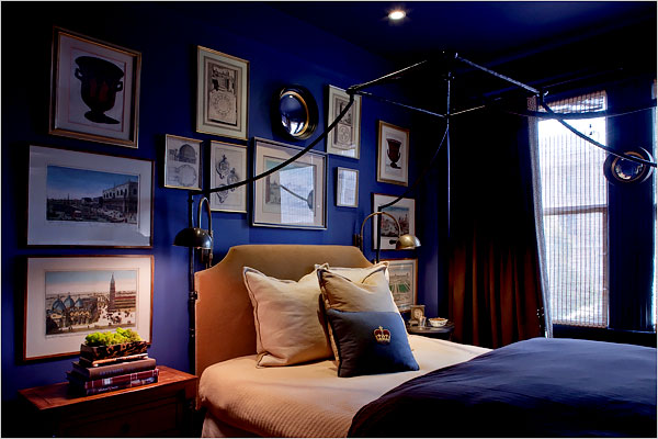
Bedroom in Farrow & Ball, Drawing Room Blue (No 253)
Farrow & Ball is basically the Rolls Royce (or is that Bentley?) of paint. At $110 a gallon, Farrow & Ball paint is pricey… Like really pricey. Why so expensive? Aside from the fact that it is imported from the UK, the premium price has a lot to do with how it is made. It is quality because they use natural pigments at higher concentrations as compared to artificial pigments with more water used by lesser paints. Also, I have been told they blend their paints using seven or more different pigments whereas most everyone else uses three pigments along with black and white (I don’t know this as fact, but it sure sounds nice).
You are probably thinking, Really? At $110 a gallon, how much better could this paint be? To which I respond… “How much will I need to paint two coats onto our cabinet doors inside and out?” A gallon? Probably…. Also, given that I am painting something that will be heavily used over the course of time, the extra $60+ for super high quality fancy paint isn’t really that much more in the big picture of an entire kitchen renovation. Sometimes you just need to splurge a little, and this seems like one of those times.
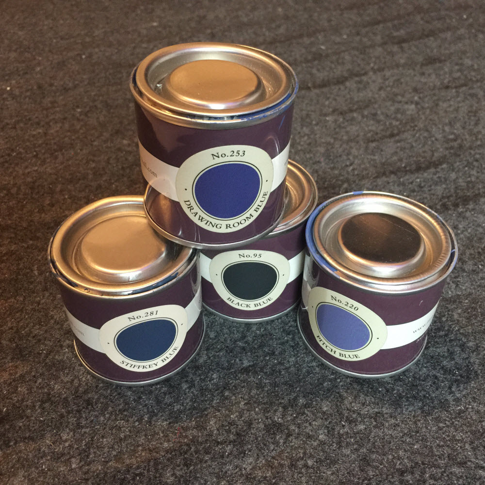
Farrow & Ball Paint Pots in the four colors we tested. These adorable little paint pots are just over three ounces each, and sell for $8.00 at our local F&B Stockist.
So early last month, Yoav and I make the trek to our local F&B store (because this IS Manhattan, and three of their twelve US showrooms are right here in the city) to pick up a few sample paint pots. F&B keeps their overall color palette highly curated and limited to 132 colors, so they keep sample pots of each one on hand for you to purchase and test out. We bought three of them (they are tiny tins, about three ounces, and sell for eight bucks apiece). The Drawing Room Blue I so want to be perfect for our cabinets, along with Blue Black (no. 95) and Stiffkey Blue (No. 281) just to see how they compared. We then promptly went home and I painted all three samples on the oak doors of our hideous particle board and oak upper cabinets (which will be trashed in the renovation, so it doesn’t matter if they are painted or not).
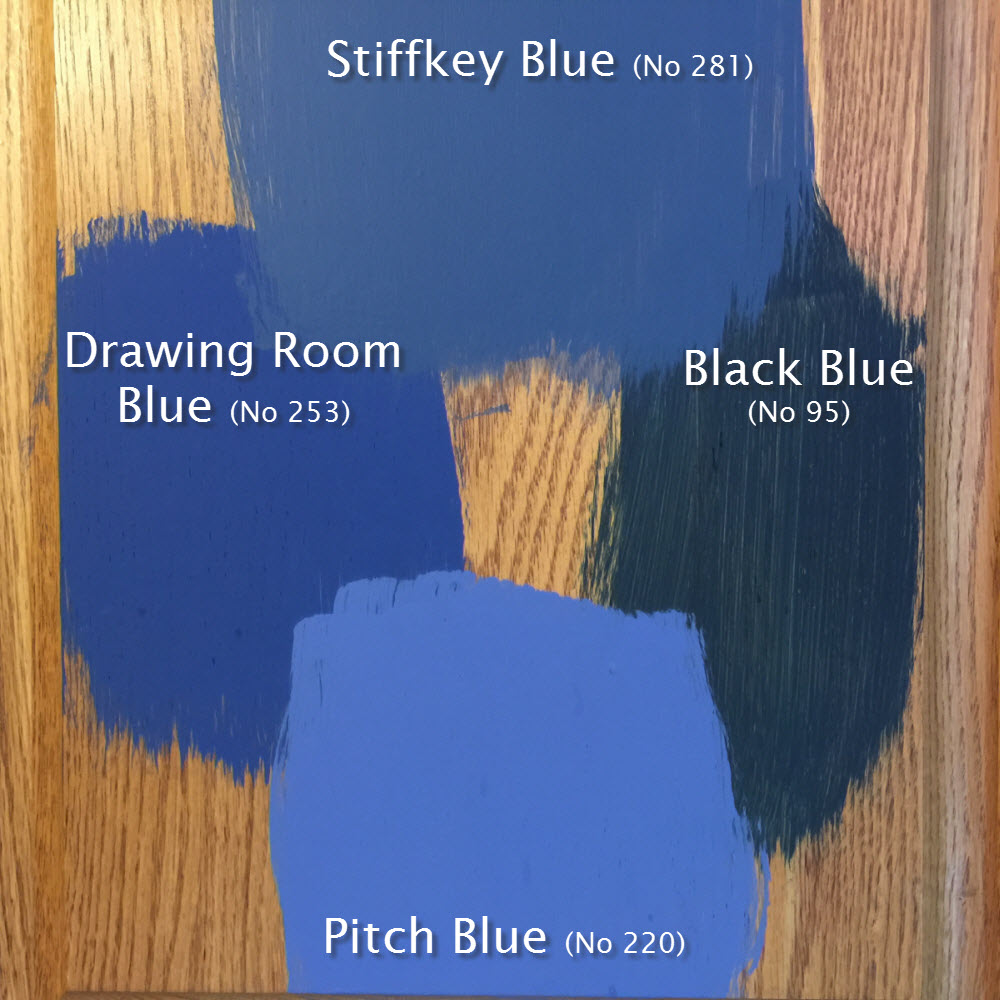
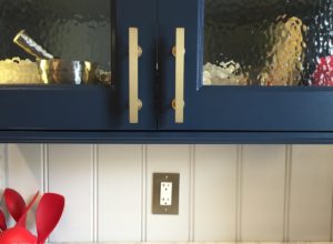
The four colors we tested on our cheap landlord oak cabinet door (which will be headed for the trash soon). As beautiful as the Drawing Room Blue is, the Stiffkey Blue is really the best choice for us.
It turns out that the Drawing Room Blue is beautiful, but bluer than Yoav liked (I liked it a lot, but although I get to make nearly all of the design decisions, he ultimately has veto power). The Blue Black is darker than I wanted and it had an unfortunate green undertone neither of us liked. Yoav loved the Stiffkey Blue, and even though I wanted the Drawing Room Blue, I had to agree with Yoav that the Stiffkey Blue was not only beautiful, but in the long term, probably the best choice for our kitchen. It is definitely blue, but it has a strong gray undertone, which ties in well with the overall palette of the room.
Then just this past weekend after three weeks of paint samples on our cabinets, I noticed that there was another shade of blue I hadn’t considered… F&B Pitch Blue (No. 220). So, we picked up a sample pot and added it to our other three color samples. At first it looked great! And the next morning in the light of day, we both liked it very much, and second thoughts began to enter our heads. But then we looked a few more times and realized it was a bit too light and there was just too much in the way of purple undertones going on. Neither of us want anyone to walk in and say “What a nice purple kitchen you have”.
So Stiffkey it is…. Or is that Stewkey? During my research on this color and it’s origins, I discovered that the color is derived from the color of the mud and cockles in the salt flats along the shores near the village of Stiffkey in Norfolk County, I also learned that the locals pronounce the villages name as “Stewkey” (sometimes written as “Stookey”).
As I wrap this very long post up, I will leave you with this beautiful little F&B video about the inspiration for our Stewkey Blue, ‘er Stiffkey Blue cabinets.
So there you have it….. Shaker-esque cabinets in Stiffkey blue. Of course more details will be spelled out as we get closer to our actual work.
Next up… Counter-tops…. Black or White? Marble, Quartz, or Soapstone?


August 4, 2015
We have used Farrow and Ball paints and they are not as good as the Dulux professional range. Do you have that in the USA? You can take the swatch of the F&B colour and get the professional one mixed at the DIY centre. It comes in white and they add the colour to it. I have F&B colours and have taken an Hermes box in to match the colour, they can do anything!
We have a London townhouse and we currently have the F&B Downpipe colour (a dark grey) in Dulux professional used a lot. Google it on the professional paint forums and you will see. You can get the exact same shade but a better finish.
We are currently knocking out the whole of our kitchen and I am researching kitchens like mad so I found your blog. It’s lovely. Thank you for all the effort you have put in.
August 4, 2015
Thanks for the comment Sara, I’m glad you like the blog.
I have read about Dulux, and that it is better than F&B, but alas it is not available in the US (Canada and Mexico yes, just not here). We had a sample of F&B Stiffkey Blue mixed by Benjamin Moore (which we have used throughout the rest of our home) and painted a sample next to the real F&B Stiffkey Blue. The color matched very well, but it fell short of F&B when it came to depth and character. Fortunately, with just the two of us, I don’t expect we will be very hard on our cabinetry over the course of time.
Best of luck with the townhouse. If the complexities of renovation in London are anything like they can be here in NYC (which I am sure they are), you no doubt have a big project on your hands.
August 11, 2015
Great blog about your experiences. I loved the navy blue kitchens. Very stunning yet not too over powering for some reason. I wanted to let you and your readers know about Painted Shaker Ikea Doors by Dendra Doors. They come fully finished and painted. The cost is more than an unfinished door obviously but it lets you sit back and just click the doors into place.
Keep up the quality posts. Well Done.